Pages

Tuesday, 12 March 2013

Tab Control Using WPF

Tab Control Using WPF Window Based

Each TabControl can contain Multiple collection of TabItem elements. TabItem has two specific attributes. Header is the string value that you see on top of each tab and IsSelected is a Boolean value that specifies if a tab is selected. Bassically only one tab can be selected at a time otherwise the first tab in list will be selected.

Two elements play main roles in Creating a tab control: TabControl and TabItem. TabControl is the container of one or more TabItem elements.

Syntax of TabControl:

  <TabControl Margin="41,46,0,0" Name="tabControl1" Height="100"  VerticalAlignment="Top"  
HorizontalAlignment="Left" Width="200" />
  
In the following tag I create the TabControl in which Height is height of the TabContr, Name is the name of the 
TabControl, The Background and Foreground properties represent the background and foreground colors of a 
TabControl. The following code  sets the name, height, and width of a RadioButton control. The code also sets 
horizontal alignment to left and vertical alignment to top
 

<TabControl>
    <TabItem Header="Tab 1">Home</TabItem>
    <TabItem Header="Tab 2">Services</TabItem>

    <TabItem Header="Tab 3">Help</TabItem>
    <TabItem Header="Tab 4">Contact Us</TabItem>
</TabControl>


XAML Code for Tab Control-

<Window x:Class="WpfApplication7.Window1"
    xmlns="http://schemas.microsoft.com/winfx/2006/xaml/presentation"
    xmlns:x="http://schemas.microsoft.com/winfx/2006/xaml"
    Title="Window1" Height="370" Width="417">
    <Grid>
        <TabControl Margin="19,21,0,0" Name="tabControl1" Height="267" VerticalAlignment="Top" 
HorizontalAlignment="Left" Width="256" IsTabStop="True">
            <TabItem Header="Home" IsSelected="True" IsTabStop="False">
                <Image  ></Image>                
            </TabItem>
            <TabItem Header="Courses" IsSelected="True" Background="Goldenrod">
                <TextBlock Background="Gray">
           </TextBlock>
            </TabItem>
            <TabItem Header="Contact Us" IsSelected="True">                
            </TabItem>
        </TabControl>    
    </Grid>
</Window>

RadioButton Control Using WPF

RadioButton Control Using WPF Window Based

RadioButton controls are usually grouped together to offer user a single choice among Different options (only one button at a time can be selected).
<RadioButton> </RadioButton> tag is used to create the radio button in XAML File.

Syntax of RadioButton:

<RadioButton Height="18" Margin="92,58,0,0" Name="radioButton1" VerticalAlignment="Top" 
HorizontalAlignment="Left" Width="82">RadioButton</RadioButton> 
 
In the following tag I create the RadioButton in which Height is height of the RadioButton, Name is the name of the RadioButton, text in the between the RadioButton tag is the content visible to user. The Background and Foreground properties represent the background and foreground colors of a RadioButton. The following code sets the name, height, and width of a RadioButton control.
The code also sets horizontal alignment to left and vertical alignment to top
 
XAML Code 
 
<Window x:Class="WpfApplication7.Window1"
xmlns="http://schemas.microsoft.com/winfx/2006/xaml/presentation"                                       
xmlns:x="http://schemas.microsoft.com/winfx/2006/xaml"                                      
    Title="Window1" Height="370" Width="417"><Grid>
<RadioButton Height="18" Margin="92,58,0,0" Name="radioButton1" VerticalAlignment="Top" 
HorizontalAlignment="Left" Width="82" Background="Crimson" Foreground="DarkBlue">M.Tech</RadioButton>
<RadioButton Height="17" Margin="92,85,126,0" Name="radioButton2" VerticalAlignment="Top"       
Checked="radioButton2_Checked" Background="Crimson" Foreground="DarkBlue">B.Tech</RadioButton>
<RadioButton Height="17" Margin="92,115,126,0" Name="radioButton3" VerticalAlignment="Top"
Checked="radioButton3_Checked" Background="Crimson" Foreground="DarkBlue">MCA</RadioButton>
<RadioButton Height="20" Margin="92,141,126,0" Name="radioButton4" VerticalAlignment="Top"
Background="Crimson" Foreground="DarkBlue">BCA</RadioButton>                  
<Label Height="32" Margin="20,15,0,0" Name="label1" VerticalAlignment="Top"
HorizontalAlignment="Left" Width="171" FontSize="18"
Foreground="DarkGreen">Plese Select Course</Label>
 <Button Height="22.861" HorizontalAlignment="Right" Margin="0,53.139,18,0" Name="button1"
VerticalAlignment="Top" Width="102" Click="button1_Click">Find Selected Item</Button>
<UniformGrid Margin="110,123,84,109" Name="uniformGrid1" />
</Grid>
</Window>
 
XAML CS Code
 
private void button1_Click(object sender, RoutedEventArgs e)               
             {
              if (radioButton1.IsChecked == true)
                     {
                MessageBox.Show("Your Selected Course is " + radioButton1.Content);
                    }
            else if (radioButton2.IsChecked == true)
                        {  
                MessageBox.Show("Your Selected Course is " + radioButton2.Content);
                         }
            else if (radioButton3.IsChecked == true)
                    {   
                MessageBox.Show("Your Selected Course is " + radioButton3.Content);
                       }
            else if (radioButton4.IsChecked == true)
                          {
                MessageBox.Show("Your Selected Course is " + radioButton4.Content);                
                  }
}
  
 private void radioButton3_Checked(object sender, RoutedEventArgs e){} 
 
 private void radioButton2_Checked(object sender, RoutedEventArgs e) {} 

Formatting and Style of Listview Using WPF Window Based

Formatting and  Style of Listview Using WPF Window Based 

The following code  sets background and foreground color of a ListViewItem.

<ListViewItem Background="LightCoral" Foreground="Red" Content="Coffie"></ListViewItem>
 
Example:
 
<Window x:Class="WpfApplication7.Window1"
    xmlns="http://schemas.microsoft.com/winfx/2006/xaml/presentation"
    xmlns:x="http://schemas.microsoft.com/winfx/2006/xaml"
    Title="Window1" Height="370" Width="417">
  <Grid Background="Beige">
        <ListView Margin="8,47,0,80" Name="ListView1" HorizontalAlignment="Left" Width="127">
            <ListViewItem Content="C" Background="LightPink" Foreground="Blue"    ></ListViewItem>
            <ListViewItem Content="C++" Background="Violet" Foreground="Blue"  ></ListViewItem>
            <ListViewItem Content="Java" Background="Silver" Foreground="Blue"  ></ListViewItem>
            <ListViewItem Content=".Net" Background="CadetBlue" Foreground="Blue"  ></ListViewItem>
            <ListViewItem Content="Oracle"></ListViewItem>
            <ListViewItem Content="SilverLight" Background="MediumSpringGreen" Foreground="Blue"  ></ListViewItem>
            <ListViewItem Content="SharePoint" Background="DarkOrange" Foreground="Blue"  ></ListViewItem>
            <ListViewItem Content="WPF" Background="Bisque" Foreground="Blue"  ></ListViewItem>
            <ListViewItem Content="WCF" Background="Gold" Foreground="Blue"  ></ListViewItem>
        </ListView>
        <TextBox Height="23" HorizontalAlignment="Left" Margin="8,14,0,0"
                 Name="textBox1" VerticalAlignment="Top" Width="127" />
        <Button Height="23" Margin="140,14,0,0" Name="button1" VerticalAlignment="Top"
                HorizontalAlignment="Left" Width="76" Click="button1_Click">Add Item </Button>
        <Button Height="23" Margin="140,47,0,0" Name="button2" VerticalAlignment="Top"
 Click="button2_Click" HorizontalAlignment="Left" Width="76">Delete Item</Button>
    </Grid>
</Window>


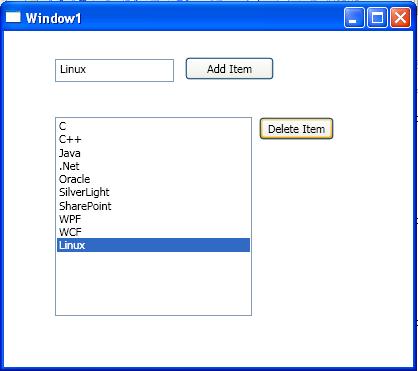
Adding Item in ListView Dynamically Using WPF Window Based

Adding Item in ListView Dynamically Using WPF Window Based

private void button1_Click(object sender, RoutedEventArgs e)
{
    ListView1.Items.Add(textBox1.Text);
}

On button click event handler, we add the content of TextBox to the ListView by calling ListView.Items.Add method. Now if you enter text in the TextBox and click Add Item button, it will add contents of the TextBox to the ListView.

Example:


Deleting ListView Items:

The button click event handler looks like following. On this button click,
 we find the index of the selected item and call ListView.Items.RemoveAt method as following.

private void button2_Click(object sender, RoutedEventArgs e)
        {
            ListView1.Items.RemoveAt( ListView1.Items.IndexOf(ListView1.SelectedItem));
        }

Example:
After press Delete Button it Will Delete From ListBox:


ListView Control Using WPF Window Based

ListView Control Using WPF Window Based

The ListView tag represents a WPF ListView control in XAML.

<ListView></ListView>

The Width and Height properties represent the width and the height of a ListView. The Name property represents the name of the control, which is a unique identifier of a control. The Margin property tells the location of a ListView on the parent control. The HorizontalAlignment and VerticalAlignment properties are used to set horizontal and vertical alignments.

The following code snippet sets the name, height, and width of a ListView control. The code also sets horizontal alignment to left and vertical alignment to top.

Syntax:

 
<ListView Margin="10,10,0,13" Name="ListView1" HorizontalAlignment="Left"
                 VerticalAlignment="Top" Width="194" Height="200" />


Adding ListView Items:

A ListView control hosts a collection of ListViewItem. The following code snippet adds items to a ListView control.

XAML CODE:


 <ListView Margin="35,40,0,97" Name="ListView1" HorizontalAlignment="Left" Width="183">
            <ListViewItem Content="C"></ListViewItem>
            <ListViewItem Content="C++"></ListViewItem>
            <ListViewItem Content="Java"></ListViewItem>
            <ListViewItem Content=".Net"></ListViewItem>
            <ListViewItem Content="Oracle"></ListViewItem>
            <ListViewItem Content="SilverLight"></ListViewItem>
            <ListViewItem Content="SharePoint"></ListViewItem>
            <ListViewItem Content="WPF"></ListViewItem>
            <ListViewItem Content="WCF"></ListViewItem>
        </ListView> 
 
Output

Menu Control Using WPF Window Based

Menu Control Using WPF Window Based

A Menu is a collection of menu items with a command associated with each menu items.  A menu item may have children menu items called submenus. This article discusses how to work with menus in XAML and WPF applications. 

The Menu tag in XAML creates a menu control.

The Name property defines the name of the menu and Height and Width represents the height and width of a menu control. 


Syntax Of Menu Control:

<Menu Margin="37,15,63,0" Name="menu1" Height="22" VerticalAlignment="Top" />
 
This Tag Creates a Menu Control. 
 
Important Properties: 
 
Name -->        Defines the name of the menu.
Height -->       Defines the Height of the menu
Width -->       Defines the width of the menu
Margin -->     Defines the position of the menu
Background--> Defines backcolor of the menu
HorizontalAlignment --> Defines the horizontal alignment of the menu inside the parent control.
HorizontalContentAlignment --> Defines the horizontal alignment for the menu content.
VerticalAlignment --> Defines the vertical alignment of the menu inside the parent control.
VerticalContentAlignment --> Defines the content alignment for the menu content.
ToolTip --> defines the tooltip for the menu.
 

A MenuItem can have other MenuItem tags within it as child/sub menus and can go up to several levels. The following code adds three children menu items to first menu item.
 

<MenuItem Header="_File">          
            <MenuItem Header="_Open" IsCheckable="true"/>
            <MenuItem Header="_Close" IsCheckable="true"/>
            <MenuItem Header="_Save" IsCheckable="true"/>
  </MenuItem>  

Adding Tooltips to Menus:

The MenuItem.ToolTip tag adds a tooltip to a menu item. The following code adds a tooltip to the Open menu item.

 
<MenuItem Header="_Open" IsCheckable="true">
    <MenuItem.ToolTip>
        <ToolTip>
             Open a file.
        </ToolTip>
    </MenuItem.ToolTip>
</MenuItem> 
 
Adding an Event Trigger to a MenuItem:

The Click event is used to add the menu item click event handler. The following code adds a click event handler for a menu item.


<MenuItem IsCheckable="true" Header="_Open" Click="MenuItem_Click">

 The event handler is defined like following in the code behind. I added a message box when the menu item is clicked.  

private void MenuItem_Click(object sender, RoutedEventArgs e) 
{      
              MessageBox.Show("Menu item clicked");  
}  

XAML Code Of Menu Control:

<Window x:Class="WpfApplication7.Window1"
    xmlns="http://schemas.microsoft.com/winfx/2006/xaml/presentation"
    xmlns:x="http://schemas.microsoft.com/winfx/2006/xaml"
    Title="Window1" Height="370" Width="417">
    <Grid>
        <Menu IsMainMenu="True" Background="WhiteSmoke">
            <MenuItem Header="_File" Click="MenuItem_Click" FontSize="15" Foreground="Blue">
                <MenuItem Header="_Open" IsCheckable="true" Click="MenuItem_Click">
                    <MenuItem.ToolTip>
                        <ToolTip>
                            Open a file.
                        </ToolTip>
                    </MenuItem.ToolTip>
                </MenuItem>
                <MenuItem Header="_Close" IsCheckable="true"/>
                <MenuItem Header="_Save" IsCheckable="true"/>
            </MenuItem>
            <MenuItem Header="_Edit" Click="MenuItem_Click_1" Foreground="Blue" FontSize="15" />
            <MenuItem Header="_View" Click="MenuItem_Click_2" Foreground="Blue" FontSize="15" />
            <MenuItem Header="_Window" FontSize="15" Foreground="Blue" />
            <MenuItem Header="_Help" Click="MenuItem_Click_3" Foreground="Blue" FontSize="15" />
        </Menu>
    </Grid>
</Window> 
 

Progressbar Control Using WPF Window Based

Progressbar Control Using WPF Window Based

The ProgressBar tag in XAML represents a WPF ProgressBar control.
<ProgressBar></ProgressBar>


The Width and Height properties represent the width and the height of a ProgressBar. The Name property represents the name of the control, which is a unique identifier of a control. The Margin property tells the location of a ProgressBar on the parent control. The HorizontalAlignment and VerticalAlignment properties are used to set horizontal and vertical alignments.

Syntax of ProgressBar:

<ProgressBar Margin="10,10,0,13" Name="ListView1" HorizontalAlignment="Left"
VerticalAlignment=
"Top" Width="300" Height="30" />

Setting up ProgressBar Value :


The Value property of ProgressBar sets up the current value of a ProgressBar control. In the following code, I set the Value property to 60 .


<ProgressBar Margin="10,10,0,13" Name="PBar" HorizontalAlignment="Left"

                 VerticalAlignment="Top" Width="300" Height="30" Value="60" >           

        </ProgressBar>


Next up, we are going to add an animation that will automatically fill and unfill the progress bar. So we are going to add a Trigger that fires after our progress bar has loaded. That trigger will fire a storyboard with an animation. The animation will be set to increase the ProgressBar.Value from 0 to 100 over the course of 1 second. We set the autoreverse property to true, to allow the animation to go forwards and backwards. The xaml to do this would be:
 
.XAML Code:

<Window x:Class="WpfApplication7.Window1"
    xmlns="http://schemas.microsoft.com/winfx/2006/xaml/presentation"
    xmlns:x="http://schemas.microsoft.com/winfx/2006/xaml"
    Title="Window1" Height="370" Width="417">
    <Grid Background="Beige">

        <ProgressBar Margin="119,136,126,0" Name="ProgressBar1" Height="24" VerticalAlignment="Top">

            <ProgressBar.RenderTransform>

                <RotateTransform Angle="0" CenterX="75" CenterY="12" />

            </ProgressBar.RenderTransform>

            <ProgressBar.Triggers>

                <EventTrigger RoutedEvent="ProgressBar.Loaded">

                    <BeginStoryboard>

                        <Storyboard>

                            <DoubleAnimation
       
        Storyboard.TargetName="ProgressBar1" 
       
        Storyboard.TargetProperty="Value"
       
        From="0" To="100" Duration="0:0:1" 
       
        AutoReverse="True" RepeatBehavior="Forever" />

                            <DoubleAnimation
       
        Storyboard.TargetName="ProgressBar1" 
       
        Storyboard.TargetProperty="(RenderTransform).(RotateTransform.Angle)"
       
        From="0" To="360" Duration="0:0:2" 
       
        AutoReverse="False" RepeatBehavior="Forever" />
                       </Storyboard>
                    </BeginStoryboard>
                </EventTrigger>
            </ProgressBar.Triggers>
        </ProgressBar>
    </Grid>
</Window>