Stack Panel Control in WPF
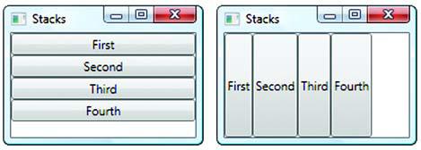


As with the other layout panels, the StackPanel has a collection of Children that it literally shoves one after the other. You set the orientation to either horizontal or vertical to control where the items go. As shown in picture above.
You might use the StackPanel if you have a series of controls with a set width or height that you want to show up in a row. For example, you might use StackPanel when you have a series of controls in a side panel (like the accordion control in Microsoft Outlook—you can expand/contract sections for mail, calendar, tasks, and so on). The controls can all change size, and the other controls will automatically be moved to accommodate the space.
Code for Stack Panel
<StackPanel Orientation="Vertical">
<Button Width="200">First</Button>
<Button HorizontalAlignment="Left">Second</Button>
<Button Padding="10 4">Third</Button>
<Button Margin="20 20">Fourth</Button>
<Button Padding="10 4" HorizontalAlignment="Right">Fifth</Button>
<Button HorizontalAlignment="Stretch">Sixth</Button>
</StackPanel>
Adding scrolling support
Adding scrolling is easy, and, once you get used to the idea of control composition, fairly intuitive. We simply put the StackPanel (or anything else we want to automatically scroll) inside a ScrollViewer.
Code for this
<ScrollViewer>
<StackPanel Orientation="Vertical">
<Button Width="200" >First</Button>
<Button HorizontalAlignment ="Left">Second</Button>
<Button Padding="10 4">Third</Button>
<Button Margin="20 20">Fourth</Button>
<Button Padding="10 4" HorizontalAlignment="Right">Fifth</Button>
<Button HorizontalAlignment="Stretch">Sixth</Button>
</StackPanel>
</ScrollViewer>
No comments:
Post a Comment